

How to Read a Trading Chart Without Any Prior Financial Education
If you have ever opened a trading platform and stared at a screen full of colored bars, zigzagging lines, and cryptic numbers — and then quietly closed the tab — you are not alone. Most people who are curious about financial markets never get past this exact moment. The charts look intimidating. They seem to belong to a world of specialists with finance degrees and Bloomberg terminals.
But here is the truth: reading a trading chart is a skill, not a talent. And like most skills, it follows a logical structure that anyone can learn with the right starting point. You do not need a financial background. You do not need to memorize formulas. You just need someone to walk you through the fundamentals — clearly, honestly, and without the usual jargon.
That is exactly what this guide does.
What a Trading Chart Actually Represents
Before touching any indicator or pattern, it helps to understand what you are actually looking at. A trading chart is simply a visual history of price over time. Nothing more, nothing less.
The horizontal axis (X-axis) represents time — minutes, hours, days, or weeks depending on your selected timeframe. The vertical axis (Y-axis) shows price. Every point on the chart tells you what the market was willing to pay for an asset at a specific moment in time.
When you connect those points, patterns begin to emerge. And those patterns are the foundation of everything you will learn in technical analysis.
The Three Most Common Chart Types Explained Simply
Line Charts
The simplest form. A single line connects closing prices over a period. It strips away all complexity and gives you a clean picture of overall direction. It is the best starting point for absolute beginners because it removes noise and lets you focus on trend.
Bar Charts
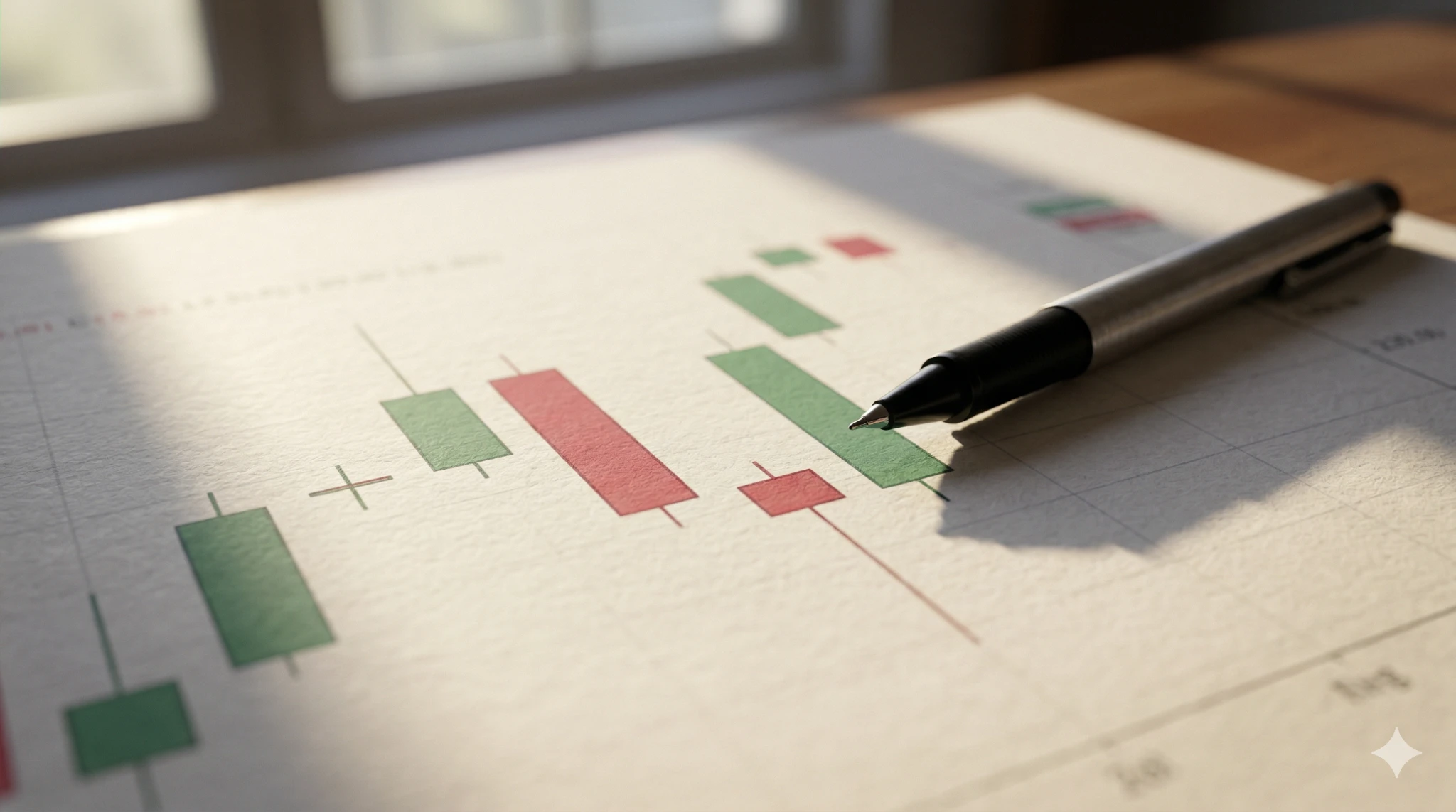
Each bar on this chart shows four pieces of information for a given time period: the opening price, the closing price, the highest price reached, and the lowest price reached. These four data points are often called OHLC — Open, High, Low, Close. Bar charts give you significantly more information than a line chart without overwhelming visual complexity.
Candlestick Charts
This is the chart type used by the vast majority of active traders. Each candlestick represents the same OHLC data as a bar chart, but displayed in a much more visual and intuitive format. The body of the candle shows the range between open and close. The thin lines above and below — called wicks or shadows — show the high and low extremes.
A green (or white) candle means the price closed higher than it opened — buyers were in control. A red (or black) candle means the price closed lower than it opened — sellers dominated that period.
Once you can read a single candlestick, you are already reading the market.
Understanding Timeframes and Why They Matter
One of the most confusing aspects for new traders is that the same asset can look completely different depending on which timeframe you are viewing. A currency pair might look like it is in a strong uptrend on a weekly chart, but dropping sharply on a 15-minute chart — and both are technically correct.
Common timeframes include:
Short-term (intraday): 1-minute, 5-minute, 15-minute, and 1-hour charts. Used by day traders who open and close positions within a single session.
Medium-term: 4-hour and daily charts. Used by swing traders who hold positions for several days to a few weeks.
Long-term: Weekly and monthly charts. Used by position traders and investors tracking macro trends.
As a beginner, starting with the daily chart is strongly recommended. It filters out the noise of short-term price fluctuations and gives you a clearer view of meaningful market structure.
The Four Core Concepts Every Chart Reader Needs
Trend Direction
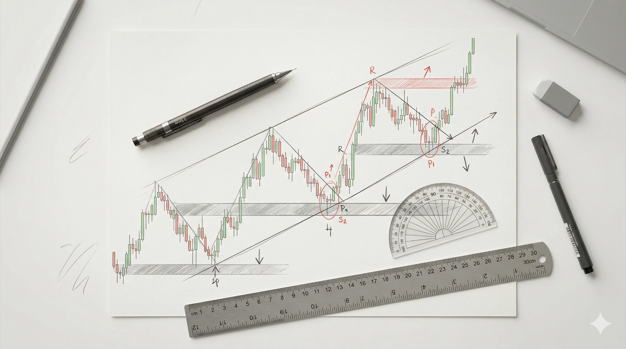
A trend is the general direction in which price is moving. An uptrend is defined by a series of higher highs and higher lows. A downtrend shows lower highs and lower lows. A sideways or ranging market shows price moving horizontally within a band.
Identifying the trend is the single most important skill in chart reading. Trading in the direction of the trend — rather than against it — dramatically improves the probability of any given trade working out.
Support and Resistance Levels
Support is a price level where buying pressure has historically been strong enough to stop price from falling further. Resistance is a level where selling pressure has been strong enough to cap upward movement.
These levels are not magic lines — they are simply areas where many traders have previously made decisions. The more times a level has been tested and held, the more significant it becomes. Identifying these zones on a chart is one of the most practical tools available to any trader at any level.
Volume
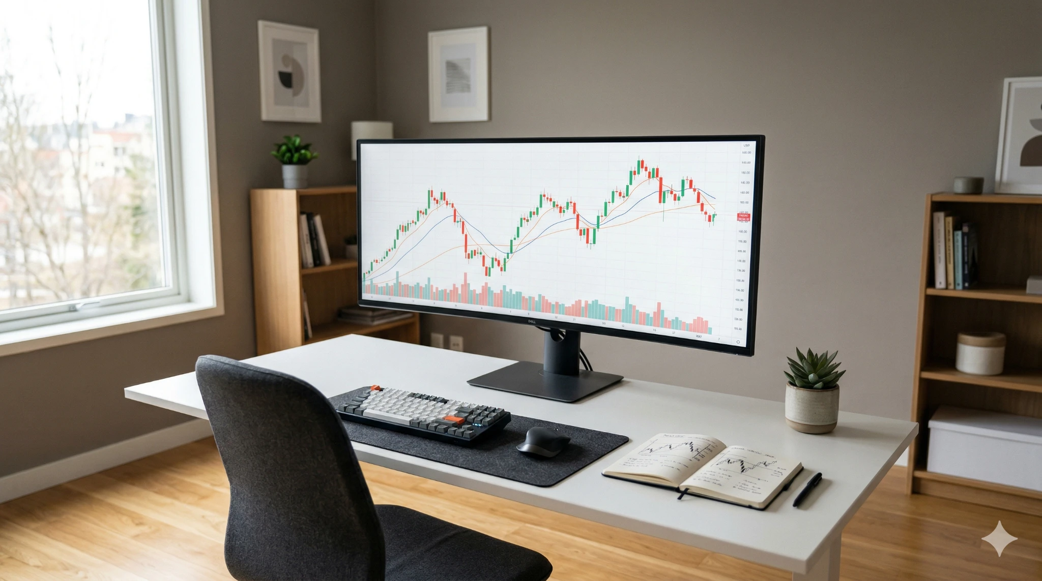
Volume tells you how many units of an asset were traded during a given period. A price move accompanied by high volume is considered more significant and reliable than a move on low volume. If price breaks through a resistance level but volume is weak, that breakout is likely to fail. If volume surges alongside the breakout, it carries far more conviction.
Many beginners ignore volume entirely. That is a mistake. It is one of the few pieces of information on a chart that cannot be fabricated.
Moving Averages
A moving average smooths out price data by calculating the average price over a set number of periods. The two most widely used are the Simple Moving Average (SMA) and the Exponential Moving Average (EMA). The EMA gives more weight to recent prices and tends to react faster to current market conditions.
Moving averages serve two main purposes: identifying trend direction and acting as dynamic support and resistance levels. When price is trading above the 200-day moving average, the long-term trend is broadly considered bullish. When it falls below, sentiment shifts bearish.
According to Investopedia, moving averages are among the most widely used tools in technical analysis precisely because of their simplicity and versatility.
How Chart Patterns Give You Probabilistic Clues
Once you understand the basic building blocks above, chart patterns become readable. Patterns are simply formations that price tends to repeat — not because the market is mechanical, but because human behavior under similar conditions tends to be consistent.
Reversal Patterns
These signal that the current trend is likely to change direction. The Head and Shoulders pattern is one of the most well-known. It shows a peak (left shoulder), a higher peak (head), and a lower peak (right shoulder). When price breaks the neckline between the shoulders, it signals a likely reversal from uptrend to downtrend.
Continuation Patterns
These suggest that after a temporary pause, price is likely to continue in the original direction. Flags and pennants fall into this category. They appear as brief consolidations within a strong trend before the move resumes.
You do not need to memorize dozens of patterns. Mastering three or four high-reliability formations and combining them with support/resistance analysis puts you ahead of most beginners.
Choosing the Right Platform to Practice Chart Reading
Theory becomes intuition only through practice. The best way to develop chart reading skills is to spend time on a real platform — observing, marking levels, testing ideas in a demo environment before risking any capital.
When selecting a forex broker to practice on, look for platforms that offer clean and customizable charting tools, multiple timeframe options, and access to a broad range of instruments. A well-designed platform removes friction from the learning process and lets you focus on developing actual market awareness rather than fighting the interface.
Demo accounts are an excellent starting tool. They let you apply everything you have learned here — trend identification, support/resistance marking, pattern recognition — in real market conditions without financial consequences.
A Practical Starting Routine for Complete Beginners
Here is a simple daily habit that builds chart reading fluency faster than any course:
Step 1: Pick one asset — a major currency pair like EUR/USD is ideal for beginners.
Step 2: Open the daily chart every morning and identify the current trend.
Step 3: Mark the nearest support and resistance levels.
Step 4: Note whether price is approaching any meaningful level or pattern.
Step 5: Write down what you observe in a simple trading journal — no trade required, just observation.
Do this consistently for 30 days and the chart will begin to speak a language you understand.
The Bottom Line
Reading a trading chart is not reserved for Wall Street analysts. It is a visual language built on logic, repetition, and an understanding of how groups of people behave under financial pressure. Start with candlesticks. Learn to identify trends. Respect support and resistance. Add volume and moving averages. Then practice — every day, on a real chart, in real market conditions.
The complexity you feared at the beginning dissolves. What remains is clarity.